A growing trend in hospital design is the creation of a stimulating, stress free space for users. The application of colour in healthcare design and its connection to mood and health has been a much discussed topic. In her 2010 article “Healing Hues: Using Color to Improve Health” Angela Wright details how “colour affects us physiologically as well as emotionally.” By stimulating the nervous system, colours can influence mood and provoke reactions, hence their use “can make environments more peaceful and less anxiety provoking. This translates into a positive mood, which encourages the healing process.” Wright is not alone in her deductions. Faber Birren’s research for his book “Light, Color, and Environment” backs them up by further elaborating that “bright and vivid colours could arouse and increase autonomic functions, blood pressure, heart and respiration rate”, whereas “softer colours create an inward response – one of calm and repose.”
Hospitals are building on these insights by commissioning acknowledged artists specialising in colour early in the design process. One such example is the Van Swieten building within Martini Hospital in Groningen that saw the famous Dutch colour artist Peter Struycken joining forces with architect Arnold Burger and interior designer Bart Vos. By making colour an integral part of both the architectural design and structural concept, the three delivered against the brief that was to build a healing, non-clinical environment with the ability to change in time. Other guiding principles for the architecture of the hospital included access to daylight, views, and orientation.
To create a flexible building with fewer fixed functions and a lot of access to daylight, Burger and Vos designed a modular-system called “Industrial, Flexible, and Demountable” – IFD with demountable modular walls and furniture. Struycken then composed a 47-colour palette from which Burger and Vos selected 19 including red, orange, yellow, green, blue, pink and purple.

Peter Struycken’s colour palette used by Vos and Burger. Source: Hospital Build & Infrastructure Magazine, Issue 1, 2013
In her 2013 interview with The Hospital Build & Infrastructure Magazine, Corinne Molenaar from Vos Interior details the strategy behind colour application. “For the actual application of colours in the new building, Burger and Vos selected 19 colours from the palette of 47, five of which were relatively neutral colours for the walls and floors. So there are plenty of colours left for future use. For the application of colours, a matrix was developed. This is a set of rules by which colours are distributed in the available space… By not thinking in terms of colour-groups, nor in terms of specific wards, but rather in terms of the hospital as a whole, each ward was now treated the same, and discussions about colour were avoided. The hospital floors were coloured wing by wing, rather than on a room by room basis. Within one room, a specific colour-field on a wall or floor could therefore unexpectedly change into a different colour. This way, it was possible to create varied rooms, whereby no two rooms in the building were the same… Based on the matrix, the colours have been rolled out through the entire building and have been translated onto the exterior as well.”
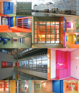
Source: Hospital Build & Infrastructure Magazine, Issue 1, 2013
Molenaar further reports that “research has shown that patients and staff react positively to colour, and that they are less likely to feel like they are in a hospital.” Based on both official statements related to the project, and generally the research available on the subject, we can safely conclude that using colour in healthcare design elevates the spirit of all stakeholders.
This article is grounded on the existing literature surrounding trends in healthcare architecture and design.