The Royal London Hospital is one of six hospitals owned and managed by the largest NHS Trust in the UK – Barts Health. The trust is one of Britain’s healthcare providers leading the way in improving patient experience. One of the strategies for making this a reality is funding a charity organisation, Vital Arts, to drive arts programmes that transform the hospital experience for all stakeholders.
In their preparation to transform the Royal London’s interior, Vital Arts conducted a series of consultations with hospital staff and patients to choose fifteen designers and artists for the project. Each of them was given a specific area to decorate, including reception areas, play spaces, elevator lobbies, and various ward settings. To make the interior less intimidating for all, the artists had to consider multiple factors prior to creating a colour palette that would deliver the brief.
Some of the most predominantly used colours in this project include green, yellow, orange, and blue. This direction might tally with a 2012 interview in Healthcare Design magazine, with director of colour marketing for Sherwin-Williams, Jackie Jordan. Jordan recommends a balance of warm and cool colours for healthcare settings. “Cool colours tend to be more calming, so things that are in the blues and the blue-greens, really put people at ease because they do bring a sense of tranquility”. She further explains how “soothing colours can affect a patient’s mood and even contribute to the healing process.” On the other hand, stimulating colours such as vibrant yellows and reds for children’s hospitals, specifically activity rooms “where children are going to have some fun for the day participating in crafts, for example.”
The new interior design of the Royal London includes painted illustrations, wood pieces, porcelain sculptures, and other 3D design elements. Director of Nursing and Governance for Children at Barts Health NHS Trust, Sally Shearer said “these fun designs are an important part of our commitment to easing children’s fears of being in a seemingly strange and scary building, to instead create a warm and comforting place of healing.”
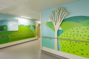
Respiratory (Ward 7E) by Miller Goodman. Source: vitalarts.org.uk
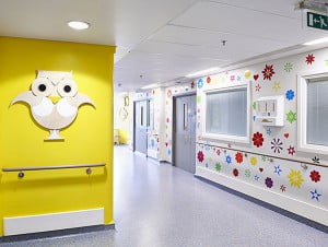
Haematology (Ward 7F) by Donna Wilson. Source: vitalarts.org.uk
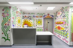
Trauma and gastroenterology (Wing 7D) by Morag Myerscough. Source: psfk.com
The idea of creating a world away from the ward is based on research proving the positive effect of environments that help reduce patient’s anxiety, both in children and adults. Those effects amount to an increase in patient’s appetite, better response to treatment, even pain relief. Textile artist Ella Doran who designed the bedside curtains with a panoramic view of the Thames confirmed the project’s success. “A seminal moment for me was when a three-year-old girl stopped crying the moment she saw the curtains, pointing excitedly to the hidden cats and rabbits. That’s when I knew my design had worked.” The Trust feel that the new interior helped in making the hospital less scary for kids, in addition to helping nurses bond and build trust with their small patients, which makes performing medical tasks much easier.
This article is based on industry research and the official information surrounding the project.